
So, this little movie called “Drive” hits US theaters in just over six weeks, and you may have gathered by now that I kind of like it. After a spiffy trailer debuted last week, a fresh poster was due, and Film District have obliged with a one-sheet that makes no bones about how they’re pitching this thing — as The Ryan Gosling Show first and foremost, with the film’s sleek thriller qualities very much in the rear-view mirror. With American audiences current lapping up Gosling’s charms in romcom “Crazy, Stupid, Love,” it’s probably canny to emphasise the cool of their in-demand star, while the kitsch hot-pink typeface (the same used for the film’s credits) offers a hint of the 1980s pastiche to come. (That corny-sounding tagline, meanwhile, references the film’s most delicious soundtrack cut.) Not the most creative design, then, but one I can see gracing a lot of teenagers’ walls in the months to come.
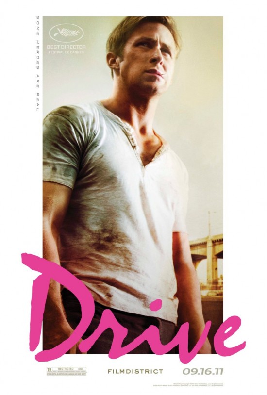
[Image: Film District]
Comments
30 responses to “‘Drive’ poster”
woah, that face does not look like gosling’s (more like his older less attractive brother).
But where are the gloves?
“but one I can see gracing a lot of teenagers’ walls in the months to come.”
Or a 22-year-old’s wall! Must. Have.
I meant teenagers and teenagers at heart, of course. ;)
I don’t know why, but I don’t like it.
I love it.
I have to admit, I sort of hate it. Looks too much like the cover of the cassette single for an inspirational pop tune by, like, Aaron Carter. Minus the context of the movie, the title and font are just way too Tiger Beat.
I preferred the darker teaser poster that was used in Cannes. I don’t hate it per se, but it just doesn’t feel like a poster to a movie that had that trailer (which is the only thing I can say since I haven’t seen the film).
And like what Nick Davis say, the font with the image work together to make it seem very Tiger Beat-ish which I’m pretty sure is not the intended message.
I can’t better Nick’s Aaron Carter quip. Whether it works or not, however, I do think it’s interesting that they’re taking this approach — how many hardboiled, male-led action films are this upfront about selling the sex appeal? (I suppose about as many as would think to use hot pink on the poster.)
Just a teaser?
Looks too incomplete / amateurish to be the definitive one-sheet.
It’s also funny how the tagline, though clearly referencing the song, works as a bit of a “fuck you” to all the superhero movies out this summer.
Hadn’t actually thought of that. Nice catch!
Kind of surprised with this approach, but can’t say I blame them. haha!!
For some reason I kind of like it.
However, I can’t help but think that if I didn’t know what the movie was, I would probably assume it was some gay-themed The Fast and the Furious-type movie.
Or maybe “Roadhouse: The Remake… except this time deliberately and unambiguously homoerotic!”
NTTAWWT.
Yikes, when you guys use abbreviations like “NTTAWWT”, I feel decidedly middle-aged. I had to look that one up.
While I appreciate the willingness to try something different, I can’t help but feel like it’s doing the film a disservice. If I didn’t know better (i.e. that the film is getting great reviews) I don’t think this poster would really grab my attention. It shouldn’t be a Hollywood Summer Action Movie poster either, but this might be a little too quirky and not enough selling.
@SJG & Guy- Seinfield reference? Am I right??
For all the Gosling hoopla that this poster may signify… it’s interesting that his name isn’t on it. Sure, he has a distinct look to him and his celebrity is growing at a rapid pace, but some people might not catch on. That’s something Johnny Depp or Leo DiCaprio could get away with… hmm. Unless I’m going blind today and can’t see his name for some reason.
Dana:
Yes, it’s from Seinfeld. “The Outing.”
Hahahahahha. Looks like a bad Levi jeans campaign. What was the goal? to market Gosling as some kind of sexy badass smooth talker? They are now selling sex over content huh? Can you say #EPIC FAIL? Go home and try again.
Also, @ Dana, you’re comment #18 is basically the same thing I said about the Ides of March poster. They show just half of Gosling’s face, and directly juxtaposed with Clooney’s, and I couldn’t help but wonder whether these poster makers are thinking Ryan Gosling is a more well-known figure than he really is.
Or maybe I’m just behind the times and he actually really is someone people just recognize as a “star”. I’m afraid I still think of him as the kid in “Goosebumps” and “Are You Afraid of the Dark?”
I forget that people who didn’t grow up watching him do cheesy Canadian children’s TV probably take him a little more seriously.
Hmm. I think the Ides poster works fine. I’m not sure that poster expects people to recognize Gosling–Clooney’s face is doing the selling there. Any young actor for the other half would do.
As for Drive, as much as I like Gosling and am looking forward to the movie, this poster seems more of a problem. I don’t think Gosling can sell a picture on his own. He’s respected as a young actor, but he’s not really a big star yet. But, again, I’m not sure this poster expects people to recognize Gosling either. As Dana points out, his name isn’t emphasized. The poster seems more about the hot dude tough guy selling the movie rather than Gosling specifically. This poster also seems to be about capturing a certain mood or type from the film’s throwback genre. Not sure it achieves that.
The comment above about flipping off the summer superheroes seems on point.
I like the first poster I saw better. But maybe this one is trying to reach beyond the indie, arthouse crowd? To mixed results I think.
Graysmith said: While I appreciate the willingness to try something different, I can’t help but feel like it’s doing the film a disservice. If I didn’t know better (i.e. that the film is getting great reviews) I don’t think this poster would really grab my attention.
I basically agree. I think that’s my issue with it.
This poster is a colossal bomb. Hideous.
I don’t like that poster at all. Very 80s to me.
@Keith- I think you may be right, actually. Maybe they aren’t trying to sell “Gosling” so much as they are trying to sell a concept or as you said, mood. I think that’s really emphasized by the pink typeface contrasted with the gray and brown-ish hues in the picture.
Reminds me of “American Gigolo” and I love that poster!
The tagline is interesting to me because it’s also building on Refn’s vision of the film as the birth of a superhero, a vision I have to say I don’t get at all. It seems he’s in his own head a bit with that.
And, by the way, I don’t like the poster at all. It doesn’t serve the film well.
[…] Posts‘Drive’ poster‘Contagion’ character postersIn praise of the modern movie soundtrackTelluride guessing […]