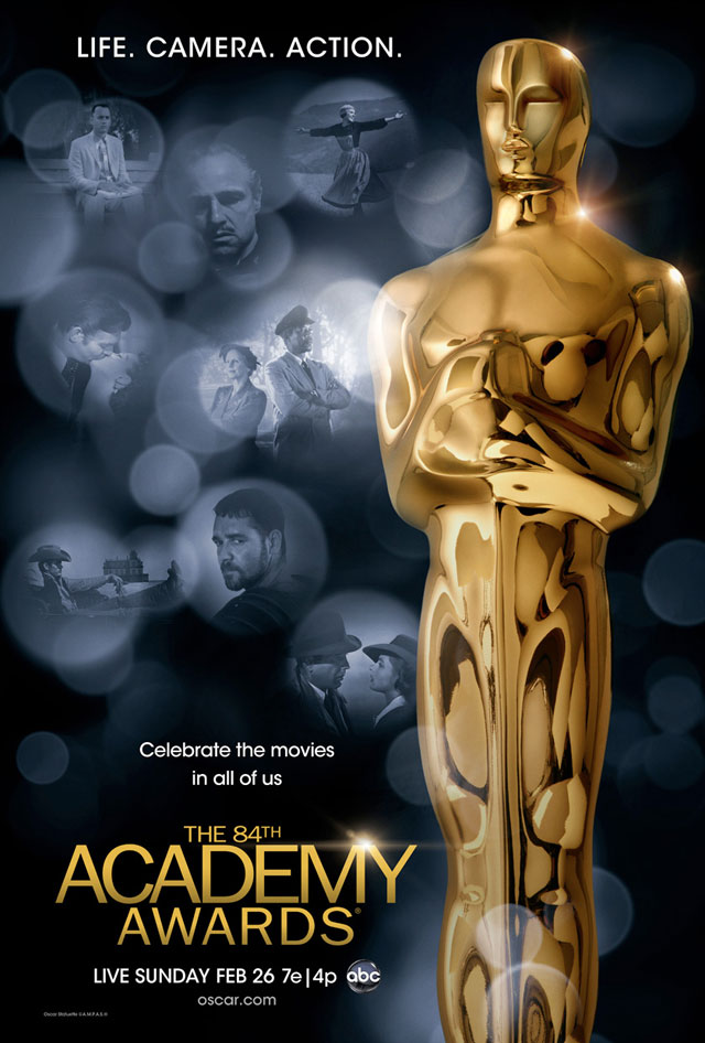
Greg Ellwood over at Awards Campaign has already posted and criticized this year’s official Oscar poster for being “instantly forgettable” and looking akin to “a home video cover for the best of an Oscar ceremony compilation.”
I don’t disagree with that. There have been some creative spins on this annual artwork over the years, but there has also always been that nagging flavor of conservative design holding things back. Still, what do you want from the Academy? All they’re interested in is having a date and the Oscar as big as possible. Tune in. That’s the message.
But I’ve been considering the film images chosen to accompany the big statue. Greg notes that “Giant” is out of place, because it’s the only film featured that didn’t win the Best Picture Oscar. The others are “Gone with the Wind,” “Casablanca,” “The Sound of Music,” “The Godfather,” “Driving Miss Daisy,” “Forrest Gump” and “Gladiator.”
If you ask me, the one that really feels out of place is “Driving Miss Daisy.” There is a film from every decade since the 1930s represented, and all of the films, with the exception of “Driving Miss Daisy,” are iconic and/or big and expansive, the kinds of things — not necessarily epics — that you’d like to see on the big screen. I might have chosen Willem Dafoe’s final, iconic moment from Oliver Stone’s “Platoon” to represent the 1980s over an impotent shot of Morgan Freeman and Jessica Tandy from Bruce Beresford’s 1989 effort (which itself beat another Oliver Stone film, “Born on the Fourth of July”).
I like the inclusion of “Giant,” because that shot of James Dean with his boots propped up is pure cinema, a classic image to say the least. But to stick with Best Picture winners, I might have chosen the image of waves lapping up onto the shore as Burt Lancaster and Deborah Kerr embrace in a kiss in 1953’s “From Here to Eternity.” A bit obvious, but that seems to be the goal, given the other selections. Or maybe a moment from the chariot race in 1959’s “Ben-Hur.”
I also don’t particularly love the shot they chose from “Gladiator.” If we’re playing up a “see it on the big screen” vibe, a shot of Russell Crowe looking over his shoulder doesn’t really do it. There are others from the film better suited, I think, but I might have sprung for something from “The Lord of the Rings: The Return of the King,” or even “The Hurt Locker,” to mix up the diversity of what is better serviced on the big screen.
And I don’t think it would have been too hard to include a shot from 1927’s “Wings” (the first-ever Best Picture winner, which has been restored and is set for a screening at the Academy in a few weeks as part of Paramount Pictures’ 100th anniversary year). The 1920s being the only decade not represented kind of sticks out a little bit, and that’s a big, visually bold film with its share of iconic images.
Oh well, I’m not in charge of the Academy’s marketing department, so what do I care.
Check out the poster below and feel free to rate it in the feature above.

For year-round entertainment news and awards season commentary follow @kristapley on Twitter.
Sign up for Instant Alerts from In Contention!


 Archives