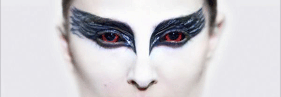
Earlier we got the trailer for Darren Aronofsky’s “Black Swan” (which is going over quite well). Now we get the poster. Unfortunately it’s just an assemblage of text on a still we’ve already seen. I’d rather have seen something velvety and sinister like the title screen of the trailer, personally, but there is an obvious black and white, yin and yang vibe going on, so maybe this is just right. Check out the full poster after the jump.

Comments
15 responses to “‘Black Swan’ poster”
Well, it’s certainly captivating at least for passersby in theaters and such. Maybe it’ll prompt them to view the trailer, where they’ll see the noirish tone and be instantly enamored.
I love this poster. I love that it’s almost all white, with the sharply contrasting and dramatically beautiful blue-black eye makeup, and how arresting Natalie’s glare is. I can’t stop staring.
Also, I have to disagree that this poster isn’t “sinister” — I think it is dark, but subtly so (which I think elevates it beyond your typical thriller/horror flick poster). Natalie’s facial expression is so stern, and her irises are completely red. Creepy, engaging, and beautiful all at the same time.
I want this poster for my room!
I love this poster. I really think it’s perfect.
I have a hard time even recognizing Natalie Portman in this poster.
@Robert- True, but once you look at her name below the title, it clicks, and then it floors you with the image and how provocative it is. But yes, if the picture stood alone, you’d be hard pressed to find someone who could tell that’s her.
Thumbs up from me. The image is pretty arresting if you haven’t seen it before — and most people in the real world haven’t.
My only qualm, and the trailer shares the blame here: given that Hershey evidently features quite prominently, an above-the-title credit would be nice. At the very least, her name would be a neat symmetrical bookend for “Academy Award Nominee Natalie Portman.”
I’ll second that. Hershey is fantastic, it doesn’t matter how long she’s been out of the spotlight. She should be given credit dammit!
If I hadn’t seen this still before, I would have probably ranked this as one of the best posters so far this year. But because we’ve seen this image before, my response is a little bit more muted. I still like it, though.
I like it. It reminds me of “Mommie Dearest”, but classy.
I’m with you on Hershey’s symmetricality, Guy.
I just noticed-we haven’t seen/heard anything of Winona Ryder being in this film?? Just saw the trailer and didn’t even see her!
Nice font.
I want this as my desktop wallpaper.
Much better than that “silly” queen in Star Wars 1. I keep comparing and they look NOTHING I mean nothing alike.
This poster gives me the creeps…in a good way.